

10 super helpful things I learned from beta testers this week
How user feedback is helping me shape the future of Future Scan

Disclosure: This post was written by me, a human, and lightly edited by Claude in such an unholy rush that I forgot to include the link to Future Scan. Also, you’ll need an access code to log in to the beta. Please DM me if you think it’s a good fit for your use case. 🙏
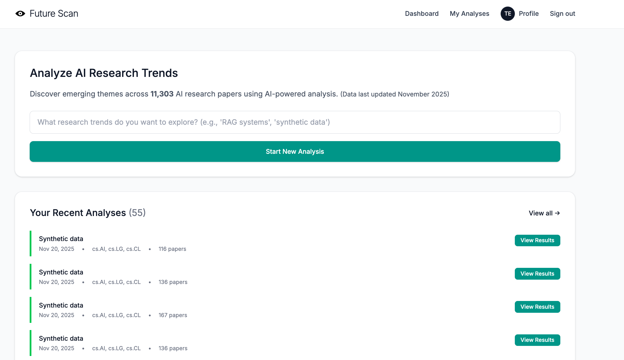
When I pushed Future Scan to production this week, I was feeling pretty proud of myself. The database populated without a hitch, the Tailwind styles behaved with Whitenoise, and processing speed was actually better online than it had been on my desktop. Perhaps just as important, the UI was clean and simple—light years beyond my early efforts with StackDigest.
I poured myself a coffee and enjoyed a few quiet moments of self-congratulation. Then I steeled my ego because it was time for beta testing, when everything I thought I knew about my project would be turned upside down.
Why beta testing is so important
Coding can be a very calm, relaxing activity, almost like knitting. You have a vision in mind and work towards it step by step. Every time a feature is tested and committed, you get one step closer to your vision. The prototype is truly your vision and yours alone. It is (or, at least, it should be) the only time you can do whatever you want.
Doing whatever you want is really fun, which is why many developers can spend months or years on a single project, continually tweaking and adding features. In fact, I did this myself when I built Good Bloggy, my first AI-powered tool. It’s a big part of why it ultimately failed to find an audience.
Now, of course, I know better. I spent only a week on the prototype. Then, once it was live, I reached out to the 10 people who agreed to help me test it. Once they did, I had a whole new direction and some great new ideas.
The surprising things I learned
My beta testers were extremely kind and diplomatic when sharing feedback. I’ve simplified and condensed their notes to be more direct for this article. They were also remarkably thorough, digging into landing page messaging and ideal customer profile, as well as the functionality of the tool itself.
As you’ll see, they zeroed in on critical issues that I needed to address immediately, not after I’d spent weeks tweaking the tool in isolation.
1. The landing page is potentially misleading.
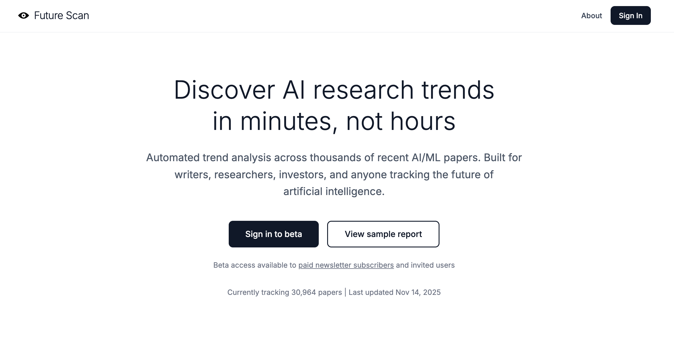
The feedback: My initial landing page used “we” and “our” in places and featured professional-looking styling via Tailwind, which is clean, simple, and has the same overall vibe as many popular SaaS websites. Based on this, a couple of users thought that readers might easily assume Future Scan was a corporation (or at least a group of people) rather than one person’s experimental project.
Because AI makes it possible for a single developer (or even a vibe coder with limited coding knowledge) to quickly build production-ready apps—and because templates and Tailwind make it easy to create a professional-looking web page—the “minnow dressed as a shark” landing page is an increasingly common phenomenon.
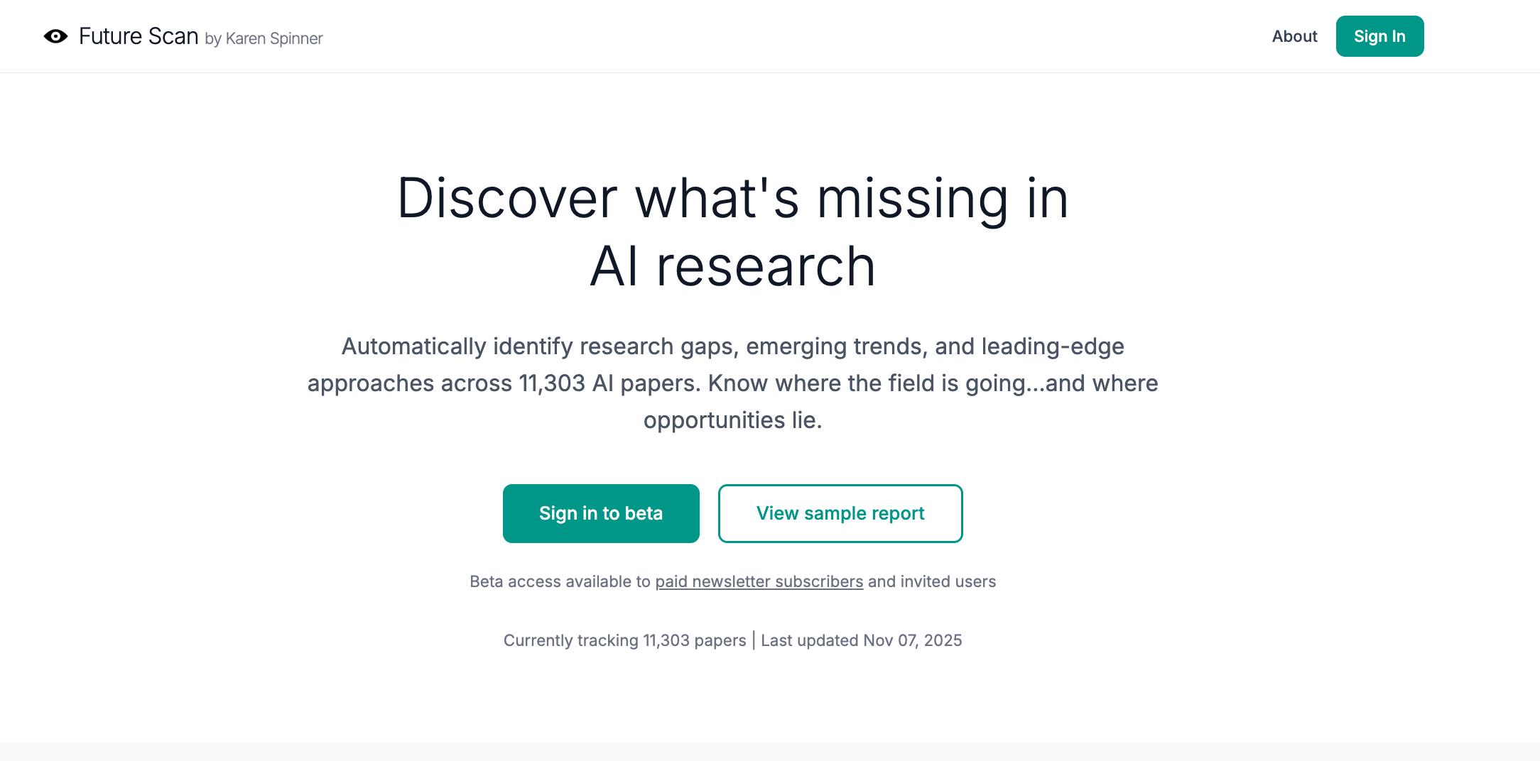
What I did: In the spirit of transparency and setting appropriate user expectations, I changed the project name to “Future Scan by Karen Spinner.” This also makes the tool’s ownership clearer to people who know me from Substack when they click through.
2. Future Scan may not actually be a perfect fit for most Substack writers.
The feedback: Multiple users mentioned that the trend analysis, which is based on abstracts and papers from arXiv (an academic preprint repository for physics, mathematics, computer science, and related fields), is very detailed and extremely technical. It includes AI/ML terminology that not everyone understands and focuses primarily on technical experiments, not surveys or sociological research.
This means that the trends it surfaces aren’t necessarily useful for a Substack writer who doesn’t specialize in the technical aspects of AI and instead wants to learn about, say, the intersection of AI and workplace policies or consumer spending habits.
The reality of the analysis—in-depth and focused on the technical AI/ML research niche—did not line up with the fairly broad messaging on the landing page that suggested Future Scan as a resource for “writers and anyone curious about the future of AI.”
What I did: I thought about it, asked a couple more writer friends to look at the tool, and realized that the feedback was 100% right. The audience for Future Scan’s analysis is almost certainly researchers at universities and corporate research labs, and to a lesser extent, investors looking for novel tech, developers seeking emerging techniques, and journalists covering technical AI research news.
I refocused the landing page to speak to this narrower audience and stopped targeting Substack writers in general, who probably don’t need to know about niche or bleeding-edge AI/ML tech trends.
I’ve also started to think about how I can improve and tailor the tool for a technical research audience—and where I’m going to find AI researchers to test the tool, which is potentially a challenge since I’ve been relying on testers and users to find me on Substack.
3. Analytic reports are too long and wordy. Papers mentioned inline should be linked.
The feedback: Everyone agreed that the reports took too long to get to the point. Even I agreed, but I’d hesitated to cut them down because I didn’t want to leave something valuable out. The lack of inline links? That was a bug. The code was trying to match paper titles to links (unreliable) instead of just using the arXiv ID.
What I did: I rethought the analysis report structure and updated the AI prompts to deliver more concise, scannable outputs using bullet-point format. Each bullet point is limited to one sentence, making it easy to quickly scan for relevant information. I also fixed the linking bug so that every paper mentioned in the analysis now includes a clickable link in the format `[Paper Title (arxiv:ID)](https://arxiv.org/abs/ID)`, making it easier to access the source material.
4. Analytic reports don’t follow known approaches to literature reviews.
The feedback: One user who has real-life experience in academia noted that the type of analysis Future Scan was performing is known as a literature review, and that there are many commonly recognized methodologies for conducting them. They shared a helpful reference guide from the University of Melbourne explaining how different types of literature reviews work and when to use each one.
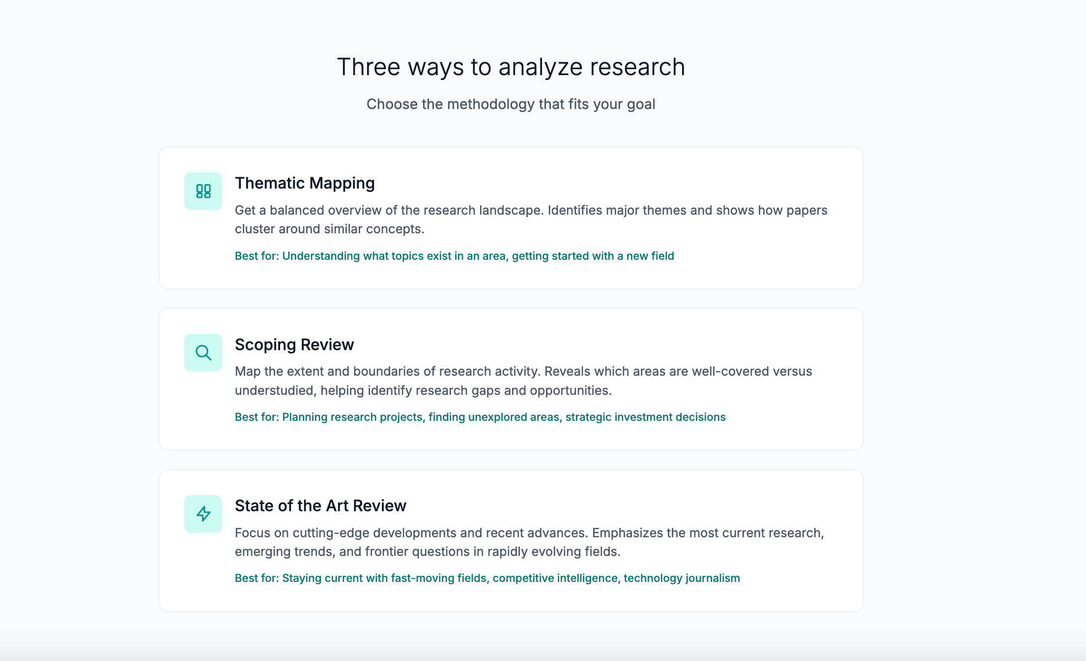
What I did: I picked three types of literature review that seemed most relevant to AI researchers:
Thematic Mapping (the default): Provides a balanced overview of what’s being researched, identifying main themes and how they connect. This is best for understanding the research landscape or writing a standard literature review.
Scoping Review: Maps the extent and boundaries of research activity, explicitly identifying knowledge gaps and understudied areas. This is ideal for PhD students exploring a new field or researchers planning future projects.
State of the Art Review: Focuses on cutting-edge developments, recent breakthroughs, and emerging trends. This is perfect for staying current in fast-moving fields or writing grant proposals that demonstrate awareness of the latest work.
All three review types analyze the same mathematical clusters of papers, but each tells the AI to focus on different aspects. The clustering doesn’t change, only what the AI looks for and reports. So a scoping review will highlight gaps and future directions, while a state-of-the-art review will emphasize recent innovations and open challenges.
I implemented this by adding a `review_type` field to the analysis form and creating three distinct AI prompt templates, each with different instructions for what to extract from the paper abstracts. For example, the scoping review prompt asks Claude to identify “Knowledge Gaps” and “Future Directions,” while the state of the art prompt asks for “Recent Breakthroughs” and “Open Challenges.”
Initial feedback: This change has been well-received. Users appreciate having different analytical lenses for different research questions and suggested further enhancements.
What I’m going to do: Further refine the existing report types and consider adding more literature review types based on researcher feedback.
5. It’s unclear how reports are produced and how AI is used.
The feedback: Multiple users referenced the “black box” problem. The analysis, they said, looks good and sounds reasonable. But it felt untrustworthy because it was coming from an AI-powered “black box.” They wanted to know exactly how papers were clustered and how they were analyzed.
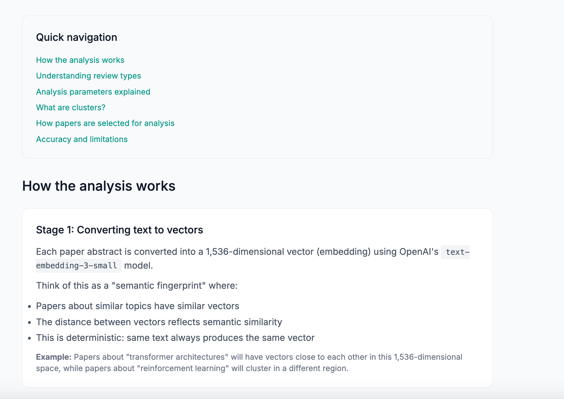
What I did: I added a detailed Methodology FAQ page explaining the three-stage process step-by-step:
Stage 1: Converting text to vectors — Each paper abstract is converted into a 1,536-dimensional vector (embedding) using OpenAI’s `text-embedding-3-small` model. This is like a “semantic fingerprint” where papers about similar topics have similar vectors. The distance between vectors reflects semantic similarity. This is deterministic; the same text always produces the same vector.
Stage 2: Mathematical clustering (no AI) — The clustering uses pgvector’s cosine similarity with greedy community detection—a mathematical algorithm, not AI. Papers with similarity above the chosen threshold become “neighbors” in a similarity graph. The algorithm starts with the paper that has the most neighbors, adds all its neighbors to form a cluster, then repeats. This is pure geometry with no neural networks involved—results are deterministic and transparent.
Stage 3: AI analysis — For each cluster, the system calculates the cluster’s centroid (mathematical center point), sorts papers by cosine similarity to the centroid, and selects the top 20 papers closest to the centroid (the most representative ones). Claude Haiku 4.5 then reads these 20 abstracts and generates structured analysis based on the chosen review type.
The FAQ emphasizes transparency features. The AI only sees what’s in the prompt (the 20 abstracts), papers are ranked mathematically (not by AI preference), every claim references specific papers users can verify, and the same inputs produce consistent outputs.
What I’m going to do: See what users think about this additional information and adjust the FAQ based on their questions and concerns.
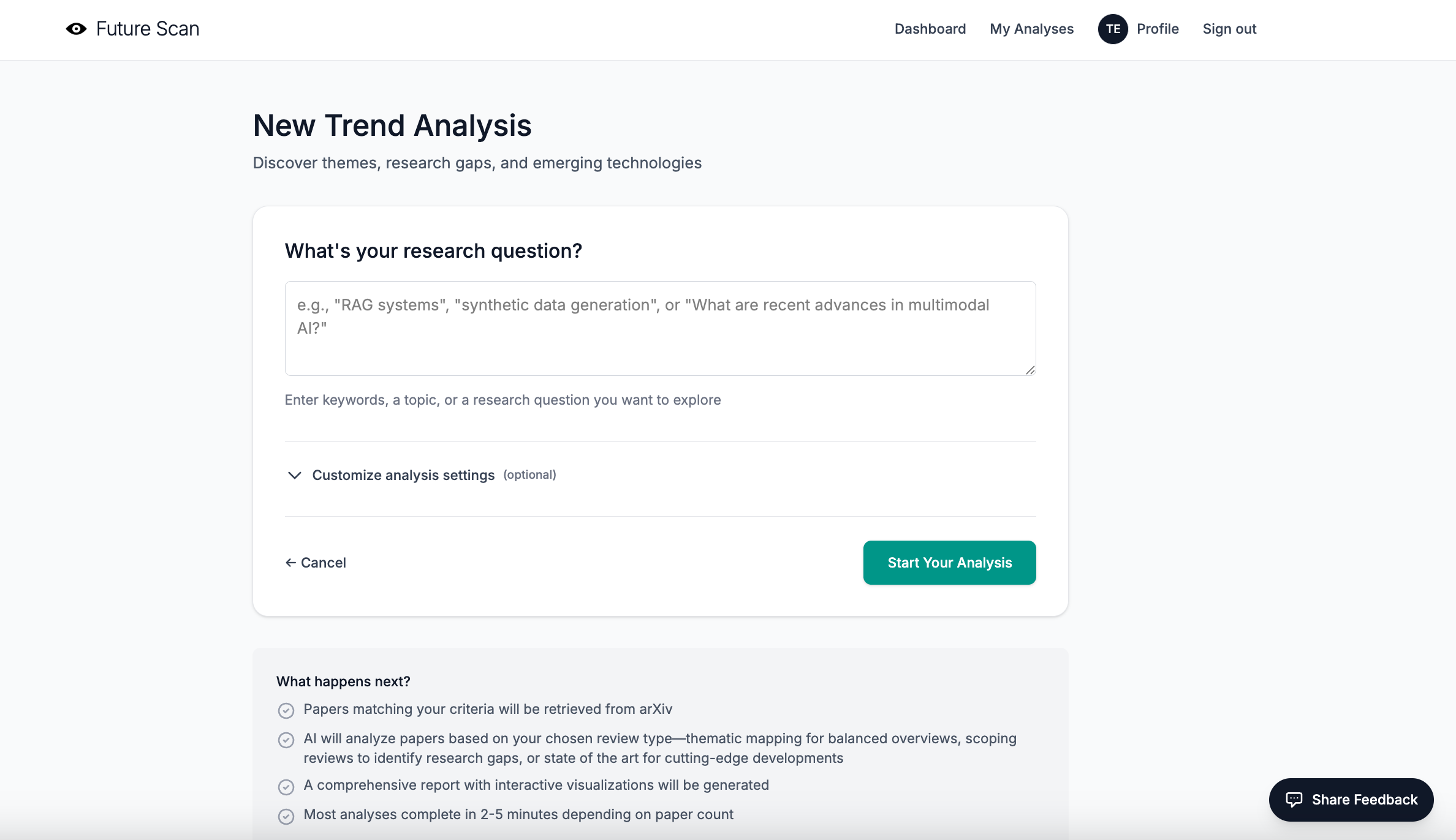
6. The analysis generation form is a bit scary for new users.
The feedback: A few people mentioned that the form used to set up and run analyses felt too long, complicated, and confusing. It included technical options (like cluster sizing and similarity thresholds) without enough explanation upfront. They felt new users could get lost in the settings when it might be more helpful for them to simply try running a report with defaults first.
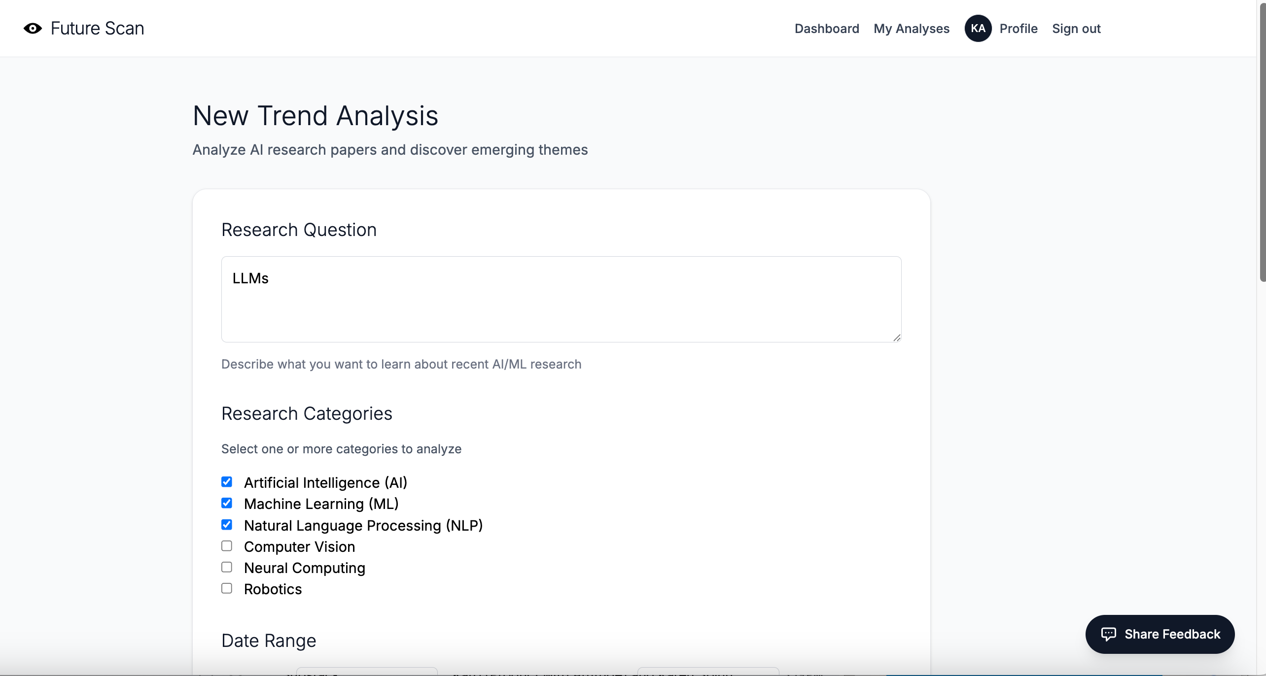
What I did: I redesigned the form to hide technical settings by default in a collapsible “Customize analysis settings (optional)” section. New users now see only the essential field—their research question—when they first arrive. If they want to customize parameters like date range, categories, review type, similarity threshold, or cluster size, they can click to expand the advanced settings.
I also added contextual help throughout the form: inline explanations for each parameter, interactive tooltips with detailed use cases for review types, and “Learn more” links that jump directly to the relevant sections of the Methodology FAQ.
What I’m going to do: Develop an onboarding sequence for first-time users that walks them through the basics of the tool and helps them understand what they can do with it.
7. What the heck am I supposed to do with that scatter plot?
The feedback: A confession: I loved the scatter plot that showed where papers appear relative to each other in 2D space. But users were at a loss in terms of what to do with it. Several noted the absence of X-Y axis labels. One mentioned that it was hard to visually process the clusters because the centroids were missing.
What I did: I initially considered adding traditional X-Y axis labels, but realized that wouldn’t make sense, because the axes represent mathematical projections from 1,536-dimensional space to 2D, not meaningful quantities you can name.
Instead, I made three improvements:
Added cluster centroids as prominent star markers (★) — Each cluster now has a large star marker at its mathematical center point (the centroid in 2D space). This gives users a visual anchor and shows where the most representative papers are located.
Added axis labels that explain what they represent — The X and Y axes are now labeled “Similarity Dimension 1 (mathematical projection)” and “Similarity Dimension 2 (mathematical projection)” to clarify that these aren’t semantically meaningful labels, but rather mathematical transformations.
Added explanatory text above and below the chart — A paragraph above explains: “This visualization maps papers in 2D space based on semantic similarity. Papers about similar topics appear closer together. Each dot is a paper, colored by cluster. Stars (★) mark cluster centers where the most representative paper abstracts are located.” An annotation below the chart reinforces that stars mark cluster centers.
In theory, users can now visually identify cluster centers and understand that the scatter plot shows semantic relationships in space, even if the axes don’t have a traditional meaning.
I’m not convinced this really fixed the problem, since introducing the idea of “Similarity Dimensions” may be too much information.
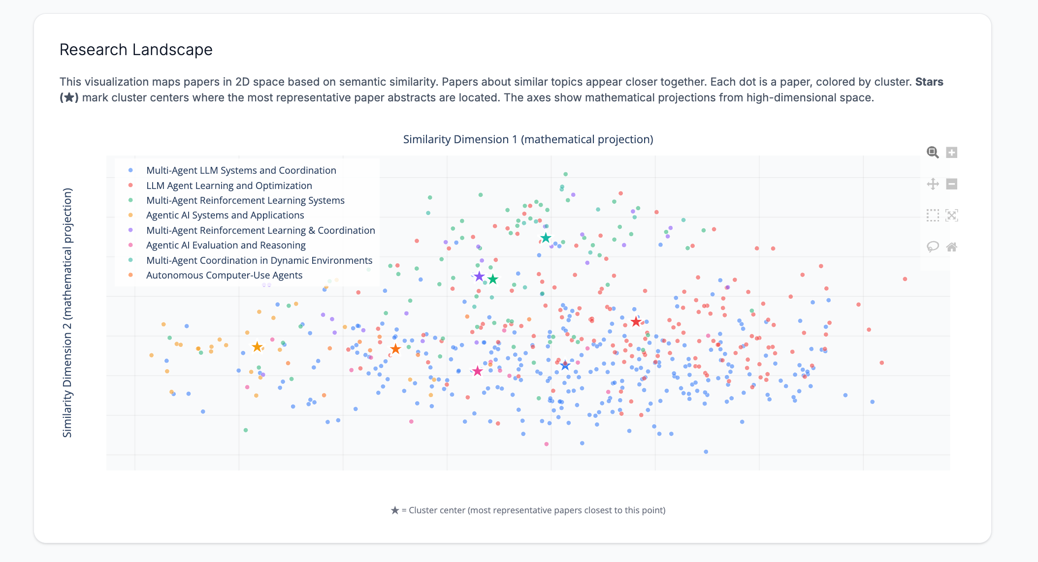
What I’m going to do: If users don’t find the updates useful, I’m going to remove the scatterplot and possibly replace it with another visualization.
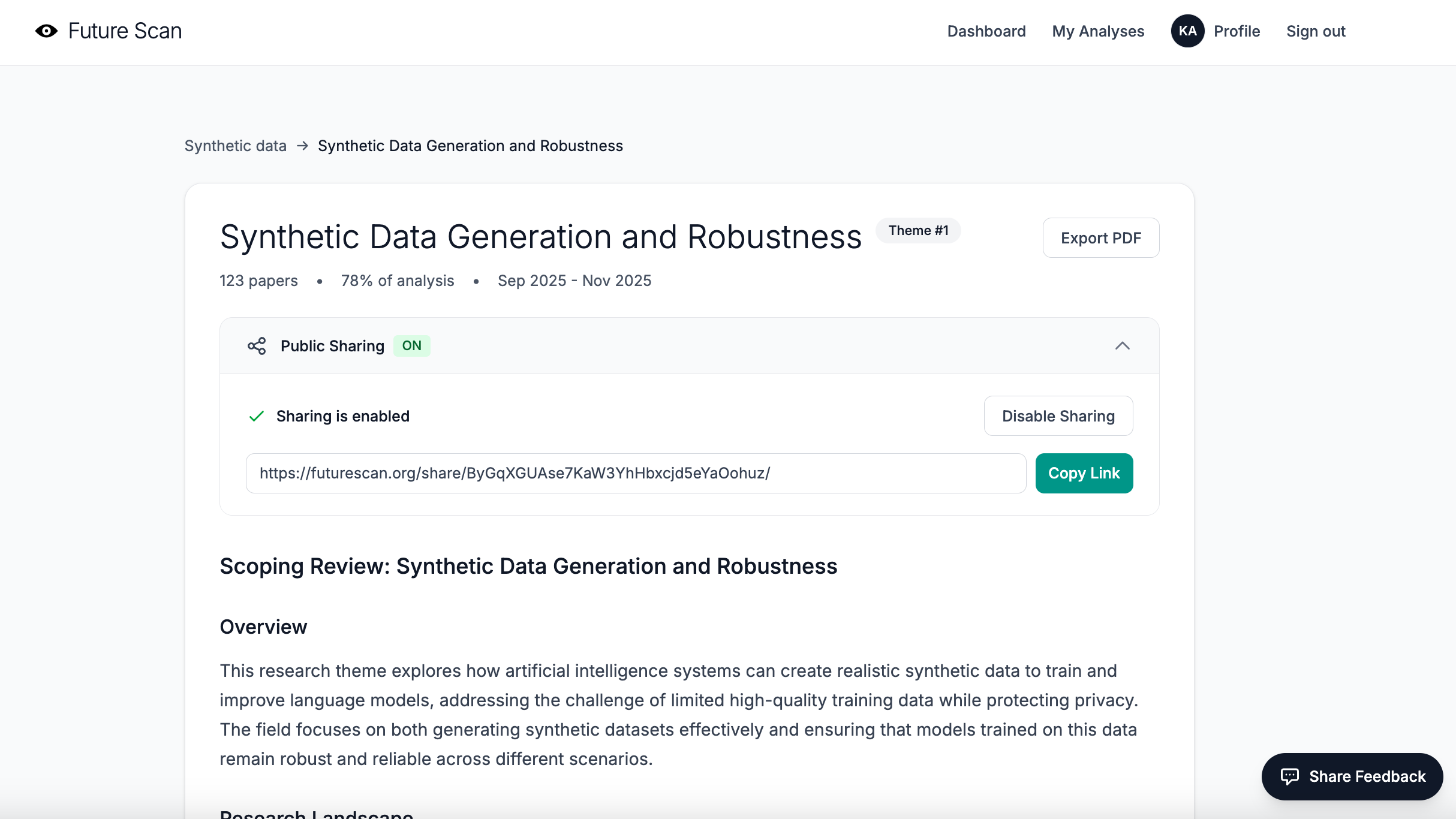
8. People may want to share via a public link instead of PDF.
The feedback: This was straightforward. A couple of people mentioned that a public link would be a great alternative to PDF exports, and also that shared links might be a good way to attract new users to Future Scan and raise awareness.
What I did: I implemented a full public sharing system. Now, any user can generate a shareable public link for their analysis reports with a single click. The shared reports are fully functional, but publicly accessible without requiring login.
9. The typography is a bit undifferentiated and hard to read, especially for first-time users.
The feedback: While the minimalist design and headings in thin typeface were elegant, they were also hard to read and didn’t differentiate hierarchies clearly enough. Users struggled to quickly scan the page and understand the information architecture.
What I did: I adjusted the typography system to create a clearer visual hierarchy while maintaining the clean aesthetic:
Increased heading font weights — Major section headings now use `font-medium` instead of `font-light`, making them more prominent and scannable.
Added consistent spacing — Implemented systematic spacing scales (using Tailwind’s `mb-6`, `mb-8`, `mb-12`) to create clear visual separation between sections and improve readability.
Improved text sizing differentiation — Ensured that heading levels have more distinct size differences (from `text-3xl` for main headings down to `text-sm` for supporting text) so users can quickly understand content hierarchy.
Enhanced contrast in key UI elements — Made buttons, badges, and call-to-action elements more prominent with better color contrast and font weights.
The result is a design that’s still clean and minimal, but more usable for first-time visitors trying to quickly understand what Future Scan does and how to use it.
10. The progress bar gets stuck and the report doesn’t appear.
The feedback: One user experienced a problem with their report timing out and hanging on the processing screen. They waited several minutes, but the page never updated to show the completed analysis.
When I checked the server logs, I found an error confirming an unexpected server restart. But the system never generated an error message or killed the processing modal.
What I did: I discovered a bug in how I was checking Celery task status. The code was relying solely on `task_result.state`, which turned out to be unreliable; sometimes it returns worker metadata instead of the actual task status, making it appear that a failed task had succeeded or vice versa.
I fixed this by implementing a more robust status-checking pattern that uses `task_result.ready()` and `task_result.successful()` to determine task completion. This pattern first checks if the task is complete (`ready()`), then checks if it succeeded (`successful()`), which is much more reliable than checking the state directly.
I also improved the progress tracking system by implementing Redis-based progress updates. Instead of just polling for task completion, the analysis task now writes progress updates to Redis at key milestones (e.g., “Fetching papers”, “Generating embeddings”, “Clustering papers”, “Analyzing clusters”).
Finally, I added better error handling throughout the analysis pipeline. If something fails, users now see a clear error message explaining what went wrong, rather than being stuck on an endless loading screen.
What’s next
The most important thing I learned this week wasn’t that I needed to fix some bugs and make the UX more friendly and accessible, although I did both! It was that I needed to rethink who my ideal audience really is. I started Future Scan thinking it would serve writers who look at the intersection of AI with other disciplines (which, right, is basically everyone). But my beta testers showed me something I should have seen earlier. The tool I built is a better fit for people doing serious technical research.
This realization completely changes my path forward. Instead of marketing to writers on Substack, I need to find researchers at universities and corporate labs, investors tracking emerging AI technologies, and journalists covering the technical side of AI development. These are the people who actually need deep, technical literature reviews of the latest AI/ML research.
The biggest lesson from this whole experience? Beta testing is for more than finding bugs. It’s for discovering who your tool is *really* for and what they *actually* need. Sometimes that means pivoting from your original vision. And that’s okay, because a tool that serves its real audience well is infinitely more valuable than a tool that serves an imaginary audience perfectly.
Finally, a big THANK YOU 🤩 to everyone who’s been testing the tool!
In no particular order: Sam Illingworth, Karen Brasch, Peter, Robin Good, Elena Calvillo, Daria Cupareanu, Kurt Schmitt, Joshua Davis 🤝, Jos T, Steve Mike Dan
And, if you’re interested in analyzing technical AI/ML trends and research gaps, and you’d like to try out the tool, please DM me for access.
Karen, it has been such a privilege and joy to help beta test Future Scan. This post demonstrates why people want to work with you. Because you listen to feedback without prejudice, implement it without difficulty (or at least that's how it looks to me!), and engage without ever taking advantage. I love what you are building and will always continue to be a champion for your work. Ad astra! 🚀
Agree with Sam’s comments. Honored to be a part of beta and I love your transparent approach to building. Will do more testing this weekend!