

Some software will always need a UI
What I learned rebuilding a neuroscience educator’s tool for getting an idea from one brain into another

Disclosure: I wrote a rough draft and outline of this article by hand and used Claude (the new Fable 5 model) to fix errors and fill in details from my codebase. Then I ran it through Pangram, and did one more light editing pass to achieve a “100% human” score. Yes, I am deeply ambivalent about this new feature.
TL;DR: I spent this spring turning a neuroscience educator’s aging PHP tool into a modern web app, and the project punched a hole in my belief that every interface will eventually dissolve into chat. The method the app teaches depends on people dragging their ideas around a canvas by hand, and that can’t happen in a conversation window. I still expect most UIs to collapse into chat, but the ones built around how brains think will stay.
When I started building software a couple of years ago, one of my biggest struggles was getting a user interface to look simple and uncluttered. I started with Bootstrap and found its components generic and hard to customize, because Bootstrap is opinionated. (That means the framework has made most of the design decisions for you. You get speed and consistency, but everything comes out looking like everything else built with it, and overriding its choices takes more effort than it should.)
I also experimented with writing my own custom CSS, and with instructing AI to write it for me, but I spent so much time tinkering with small UI components that my first project took months to finish.
Then I discovered Tailwind, and the UX across all my apps improved fast. Its classes are clearly named and cover most possible cases, so it’s easy for me and for coding agents to work with.
But soon after I upped my UI game, MCP got popular, and I noticed a lot of people using my tools wanted to access them through Claude, making my carefully designed interfaces moot. Since then, I’ve come to believe that most UIs will become obsolete as models’ native capabilities improve and more of our work moves to the chat or the command line.
Then a recent project showed me that tools designed around how human brains work will always need a UI.
The mission: Redesign an app that helps people reach their audiences
Back when I ran StackDigest, I published a recurring feature that spotlighted small newsletters (the “5 Under 500” series). The neuroscience edition is how I met Rich Carr; I picked his publication, the Brain-Centric Substack, for the roundup in October 2025.
Rich is a learning scientist and the CEO of Brain-centric Design. With cognitive neuroscientist Dr. Kieran O’Mahony, he wrote Brain-centric Design: The Surprising Neuroscience Behind Learning With Deep Understanding, and his consulting work applies that research to communication problems in business, like pitches and trainings, wherever an idea has to get from one brain into another intact.
The nested egg
Rich has packaged his approach into a structure he calls the nested egg. You distill your message to a single Big Idea, stated in plain words your audience can connect to themselves, in their situation, today.
The Big Idea gets at most two scaffolding concepts underneath it, and each scaffold is backed by a small set of supporting proofs. Every layer nests inside the one above, yolk inside white inside shell.
Why the limits work
With room for only one Big Idea, a team (or a person) has to pick the single message the audience should walk out remembering, a decision most teams avoid. The two-scaffold ceiling repeats the squeeze one layer down. Of everything you could say in support, what stays? What doesn’t fit gets cut, and deciding what to cut is most of the work.
The original app
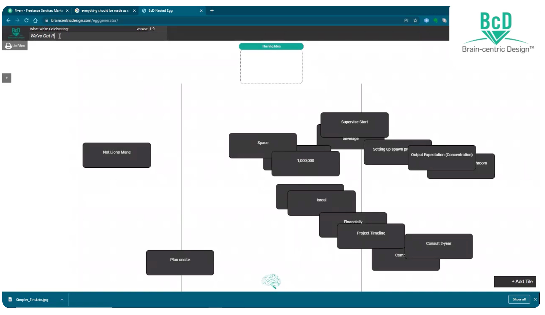
Rich had a PHP app, built years ago, that he used to walk clients through the method live. Every idea became a small card you could drag around a plain canvas, and over a session he’d help clients pull the strongest messages for a high-stakes presentation out of a cloud of candidates. The pedagogy hadn’t aged at all, but the software had.
Several months ago he sent me a DM asking if I could help him find a developer to build a modern version of the app. It sounded like a fun project, so I volunteered to do it myself.
Why this project needed a real UI
People organize and prioritize their thoughts better when they can see them, and better still when they can physically rearrange them. That’s Rich’s research talking, but anyone who has covered a wall in sticky notes already knows it.
Dragging one idea above another is a decision your hands make visible. And when several stakeholders have to agree on a message, the canvas doubles as the negotiating table. The final arrangement is something the group watched itself build, which makes it something the group will defend.
None of that carries over into a chat transcript. A bulleted list in a conversation window is the tidy, linear, pre-digested format the method exists to break people out of.
Step 1: Build a prototype
I started with a prototype on my local machine to show Rich what a modern UI could do for his method. The first commit is dated March 14, 2026. It covered a canvas of draggable tiles and the nested egg structure.
Within three days there were 23 commits, and the prototype had logins, Rich’s Mohave and Manrope brand fonts, his navy and orange palette, and a live URL. The finished app now has 246 commits. The single busiest day of the build, April 13, added 38 of them.
Step 2: Choose the architecture
I picked the least exotic stack I could assemble: React with Tailwind on the front end (the same Tailwind I praised at the top of this article), an Express API in Node, and PostgreSQL managed through Prisma. Logins use JWT with bcrypt-hashed passwords. Stripe runs the subscriptions. PDF export renders through headless Chromium, using a Puppeteer configuration I borrowed nearly line for line from CarouselBot.
I also designed the app to be easy to maintain. I wasn’t sure what the next year would look like for me professionally, and I wanted a tool that I, Rich, or whoever comes after me could keep running without much trouble. (And this was a good idea, since I started a new full-time opportunity a couple of weeks ago!)
Step 3: Move the prototype to Vercel
I chose Vercel because it made review cycles faster and easier. As soon as I pushed a change to Vercel, Rich could open the updated app on his own machine. This allowed him to review working features instead of screenshots or mockups, and provide detailed feedback across multiple features and behaviors.
The app stayed on Vercel through the spring while we worked through branding, tile behavior, and the guided flow that walks a first-time user from brainstorm to finished map.
Step 4: Align my vision with Rich’s pedagogy
My early builds imposed more order on the canvas than the original PHP app, which I initially thought was an improvement. Tiles snapped to a grid, and ideas were automatically grouped into neat lists, because lists are easier to read.
But Rich asked me to roll back both. He explained that the disorder is intentional. When ideas can lie scattered and overlapping, people stay willing to put unfinished thoughts on the canvas, and dragging a thought from one spot to another is the act of prioritizing it. Arranging the tiles neatly would have removed the cognitive exercise the app exists to create.
That constraint is now written into the repo’s conventions file. Reordering is drag and drop only, and arrow buttons must never be added. A second rule requires double-click editing and dragging to work on every tile at every stage of the process.
Step 5: Add refinements
Once the main canvas worked, I added three features:
Share links. Any map can generate a read-only link that opens without a login, so participants can review a map after a session ends. Links can be revoked at any time, and the shared view shows only the map itself.
PDF export. The server renders a finished map as a branded landscape one-pager with a Clarity Statement at the bottom, which is a plain-English paragraph assembled from the Big Idea, the scaffolds, and the proofs, with enough grammar logic to produce readable sentences. Clients leave the session with a document they can forward to colleagues.
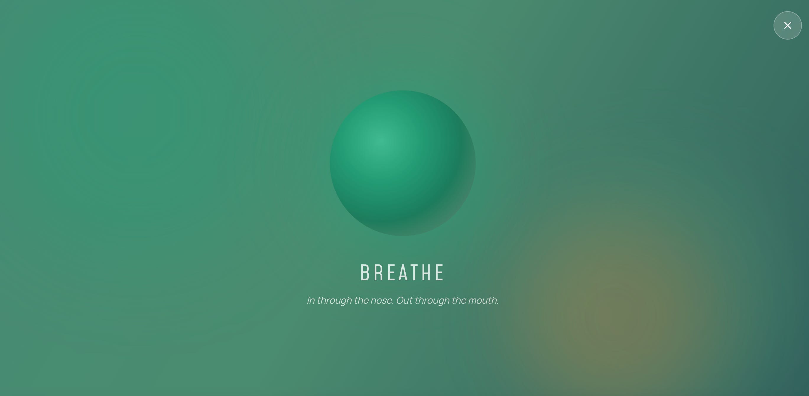
Take a break. One click opens a full-screen overlay with a slowly pulsing orb and one instruction, “In through the nose. Out through the mouth.” Because the method requires sustained thinking, the overlay gives people a simple way to pause and regroup partway through a session.
Step 6: Move from a shared Vercel environment to a dedicated HostGator server
For production we left Vercel and deployed to the dedicated HostGator server that already runs brain-centric.com. The unglamorous choice again, and again deliberate. The marginal hosting cost is zero, because Rich already pays for the server.
The PostgreSQL database runs on hardware he controls, so his client data never touches a metered third-party cloud. The whole product is administered through the same cPanel he has used for years. A deploy is a git pull, a dependency install, and a process restart, about two minutes end to end, with a maintenance mode that shows visitors a friendly “back shortly” page whenever we want extra caution.
Step 7: Move the codebase of record to GitHub
This month the repository moved to GitHub, under Rich's own account. Now, we both can make changes to the code, and Rich can add another developer to help with ongoing maintenance whenever that’s needed.
The repo also includes guides written in plain language that cover how the app is put together, how to deploy, and how to make changes by describing them to Claude Code in plain English.
Why you should try this tool
The Clarity Map is deliberately AI-free. It will not generate ideas for you, rank them, or suggest a Big Idea. It provides a structure that helps turn free-form ideation into a communication plan that reflects your best thinking.
Also, its output, a one-page map plus its Clarity Statement, makes a great brief an excellent brief to hand an AI afterward.
There’s a free trial at https://claritymap.brain-centric.com.
Join Rich on August 5 to see the Clarity Map in action
Rich is hosting a live webinar on Wednesday, August 5 at 1:00 PM Pacific. He’ll build a Clarity Map in real time, on problems attendees bring, which is the best way to watch the method in action. Everyone who attends gets a discount code for a Clarity Map subscription, which will be announced during the session.
Registration is free at https://claritymap.brain-centric.com/webinar
What this means for the future of UX
I still believe most interfaces are on borrowed time. Dashboards, admin panels, settings screens, and CRUD forms all exist to ferry data between a human and a database, and that work will largely be taken over by chat and automated agents.
But interfaces will remain important for cases where the experience is the entire goal, such as creativity, ideation, or training. The Clarity Map’s canvas is intended to elicit new thoughts from a human brain. No conversation with a model can replace the moment someone slides one message above another and watches their message come into focus.
In other words, if the screen is where the thinking happens, invest in it. But if the screen is there for information retrieval or data input, a model will be doing that job soon enough, and you don’t really need a UI.
By the time the webinar runs, my part in this project will be winding down. But it was exciting to learn about Rich’s process, and build a UI that actually matters.
You buried the headline, Karen. Most developers would have "fixed" the messy canvas, shipped the neat version, and quietly broken the tool.
You asked why the mess mattered, then made the mess a protected feature.
That judgment, knowing which disorder is load-bearing, is exactly the thing no model does yet, which makes your closing argument stronger than you let it be. Judgement...you have it in droves, and talent to match.
Grateful for every one of those 246 commits, and congratulations on the full-time gig. Built to last was the right call in more ways than one. 🙏🥰💯
Thank you, Thank you, for one of the most pleasant & gratifying build experiences this intelligent novice has ever been party to.
Thanks for the article.
This paragraph appears twice: "The PostgreSQL database runs on hardware he controls, so his client data stays off third-party cloud services. The product is administered through the same cPanel he has used for years. A deploy is a git pull, a dependency install, and a process restart, about two minutes end to end, and a maintenance mode can show visitors a “back shortly” page while we work."