

10 things I learned from CarouselBot’s beta testers
And what this means for the Roadmap

Disclosure: This post was written by me, a human who really doesn’t like fiddling with Canva to build carousels for LinkedIn, and edited by Claude. The featured tool, CarouselBot, was written in Next.js using Claude Code, except for one afternoon when Claude went offline and I had to manually debug.
CarouselBot has remained stable on Vercel despite 30 or so people using it intermittently. Now I want to stress test it by adding another 20 or so users to the mix. If you’re interested, feel free to send me a DM or leave a comment.
This has been a big week for the CarouselBot project, which just got its very own domain (carouselbot.app) and reached 30 beta users, many of whom have made multiple carousels. Even better, beta users shared lots of helpful feedback, some of which really surprised me.
No matter how well I think I’ve tested an app and how bug-free I think it is, I’m always missing something. And it’s often something big. Fortunately, everyone testing CarouselBot has been willing to provide feedback that’s both direct and constructive.
And their notes, usually arriving in the form of DM chats, have allowed me to make some important decisions about the tool’s future direction.
Keeping it simple... and flexible
I made a conscious decision to share CarouselBot in its MVP state, because I didn’t want to spend a lot of time developing something people weren’t actually going to use.
I originally built it as a simple alternative to cut-and-pasting copy into Canva templates. And I was committed to keeping it simple, since Canva is already a great tool for anyone who wants templates and precise design control. But the question was, how simple?
And how could I balance simplicity with flexibility, so users could make carousels that looked and felt like their brand?
Beta testers had no shortage of ideas. Some prompted me to make immediate updates, and others shaped my longer-term plans for evolving the tool.
1. Delete/add/move slide functionality is not optional
This should have been there from the beginning, and I’m embarrassed it wasn’t. 😬
When I built the initial version of CarouselBot, I was so focused on the AI content generation piece that I missed something obvious: people need to be able to rearrange their slides. The AI might generate six slides, but maybe you only want five. Or maybe slide three should actually come after slide five. You get the idea. Once I learned about this, I fixed it fast.
In the current implementation, you can delete any slide (minimum of one slide to maintain a valid carousel), add new slides either at the end or after any specific slide (up to 30 slides maximum), and move slides up or down to reorder your content flow.
I also learned something important about context when regenerating slides. When a user asks the AI to regenerate a single slide, I now pass the full context of surrounding slides to the API. This helps the AI understand the flow of the carousel and generate content that fits naturally between what comes before and after.
This seemingly basic functionality improved the user experience. Beta testers went from frustrated (“Why can’t I just delete this slide?”) to empowered (“I love how easy it is to reorganize everything”).
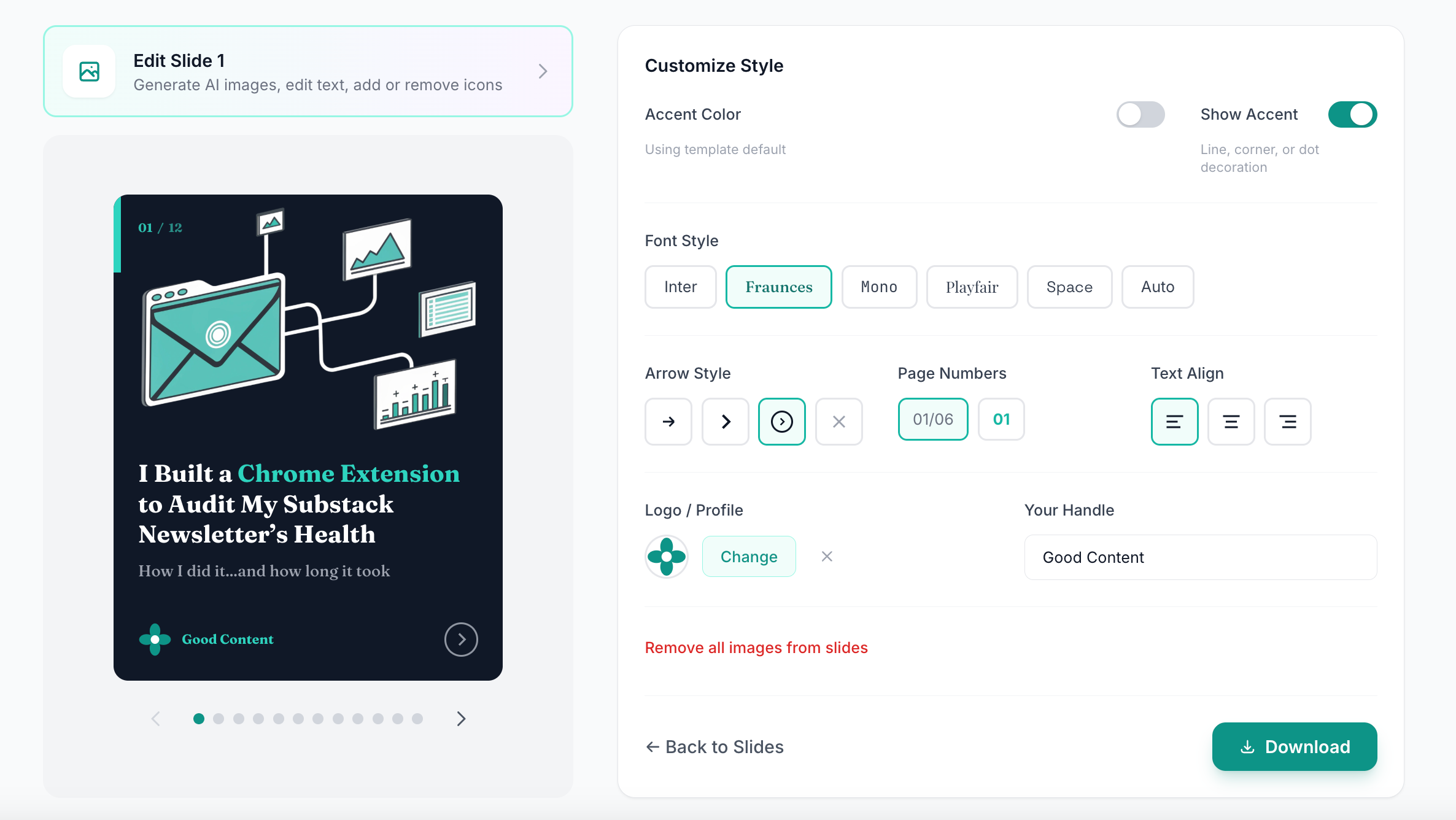
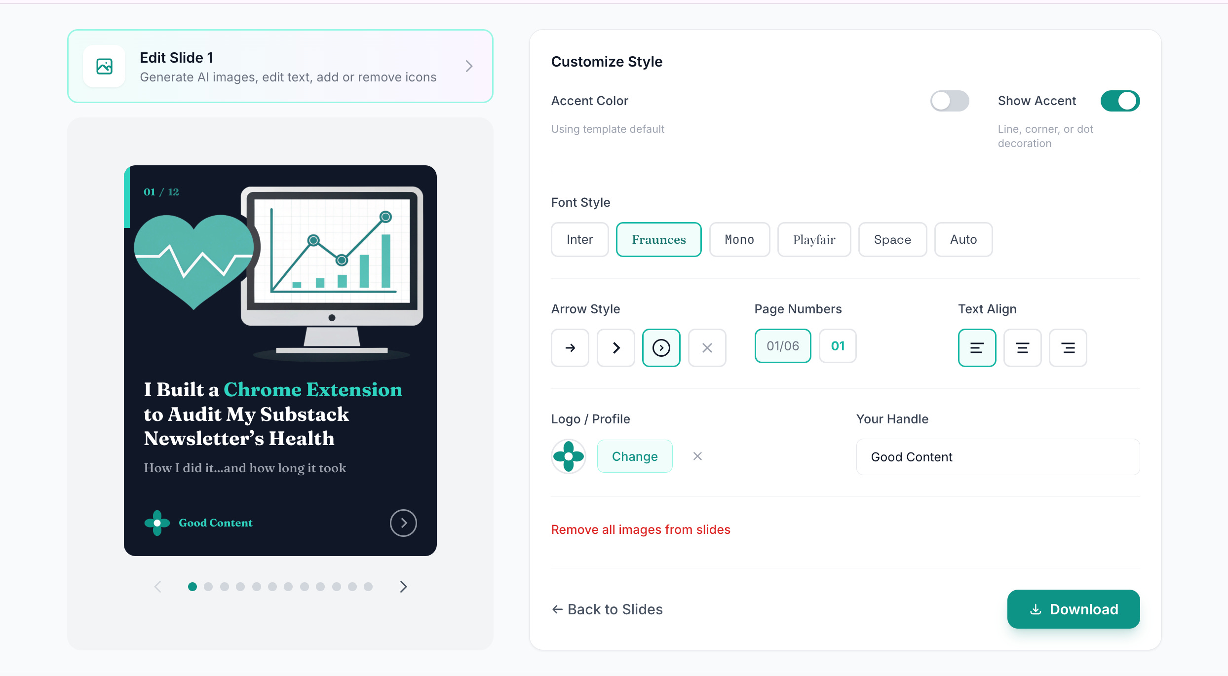
2. More brand customization is better
This came up over and over again. Users wanted their carousels to look like their creations, not generic templates that could belong to anyone.
CarouselBot currently offers 15 distinct templates across three categories—dark themes (like Dark Pro, Navy, Forest, Midnight), light themes (Light, Warm, Sage), and gradient themes (Sunset, Ocean, Emerald, Dawn). Users can also upload a logo or headshot, choose from five font families, pick their text alignment, and toggle accent shapes on or off.
But this was not enough.
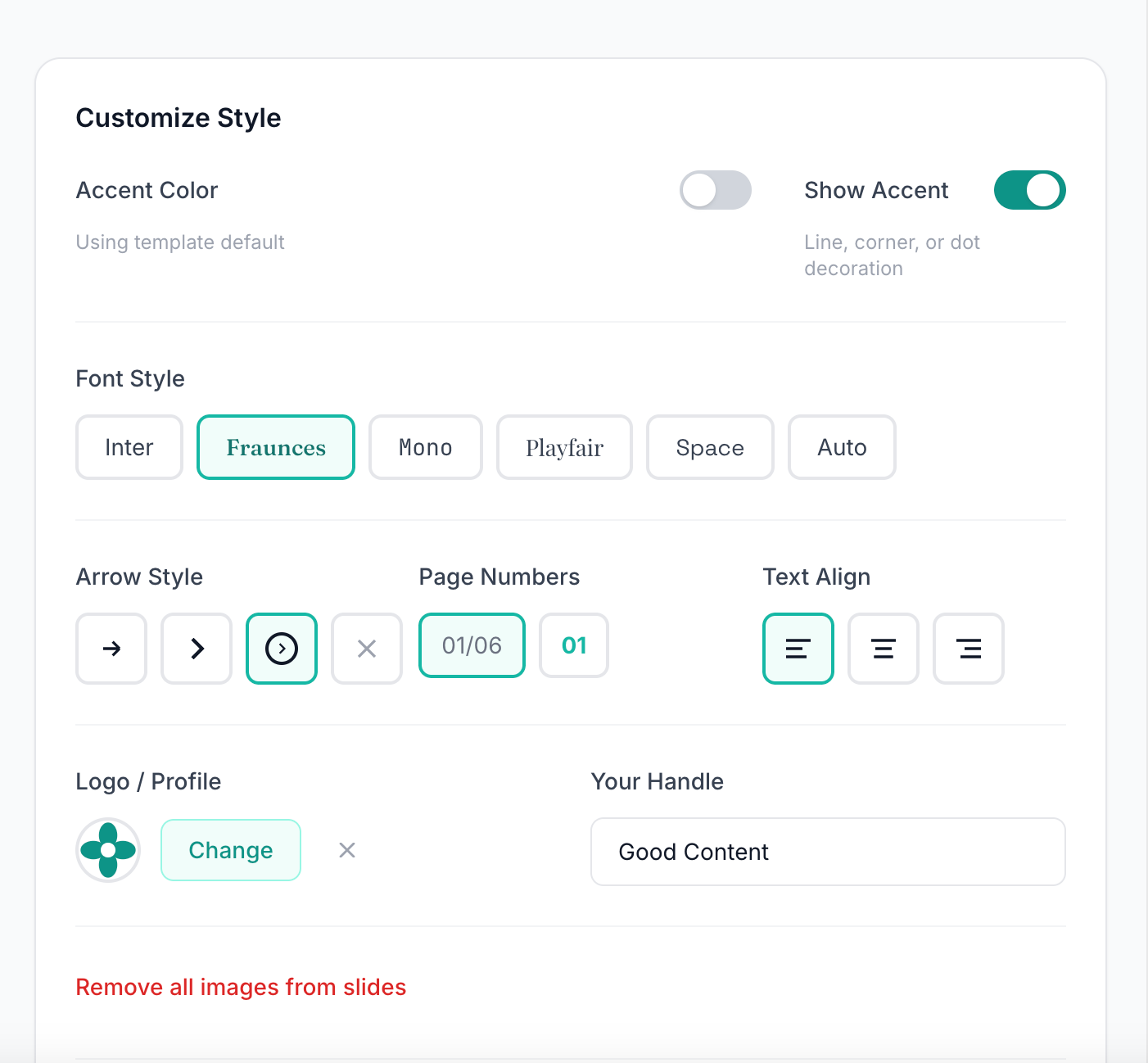
In response to feedback, I added custom accent colors. Beyond the template defaults, users can now choose from a preset palette (teal, cyan, blue, purple, pink, emerald, lime) or use a full color picker to select any brand color. This accent color appears in highlighted text, page numbers, icons, and decorative elements.
And I’m planning a major enhancement that should provide more and better options for customization. The Custom Template Studio, which I’m actively building, will address the most common requests I’m still hearing: custom background colors and image placements, the ability to save multiple accent color presets, and more flexible layout options.
It’s the feature I’m most excited about, and also the one I’m most nervous about getting right. The whole point of CarouselBot is avoiding fiddly design controls, so the template studio needs to feel more like choosing options from a menu than building something from scratch.
3. Nobody wants to actually drag and drop design elements
This was the validation I needed to stay focused on CarouselBot’s KISS (Keep It Stupid Simple) values.
When I asked users what they loved most about the tool, most said the answer was that they didn’t have to make design decisions. The AI generates a first draft of the content that’s just the right length, suggests appropriate layouts (hook slide, stat slide, list slide, quote slide, or call-to-action), and the template system handles all the visual formatting automatically.
No dragging text boxes. No resizing images pixel by pixel. No agonizing over whether this headline should be 32pt or 36pt.
This reduced cognitive load and decision fatigue is a big part of CarouselBot’s product identity. Tools like Canva are powerful precisely because they give you complete control. But that control comes at a cost, which is that you have to make hundreds of micro-decisions to create a single carousel.
CarouselBot is different. You make the big decisions (what content, what template, what brand colors), and the tool handles everything else. The goal is a five-minute setup, not a five-hour design session.
4. Some slide formats were fighting with LinkedIn’s built-in navigation
This was a priority fix that I’m glad beta testers caught early.
LinkedIn’s carousel viewer has built-in navigation arrows and UI elements that overlay on top of your slides. On certain layouts (particularly slides with bullet points and copy near the edges), the navigation elements were obscuring important content. I hadn’t noticed because I was testing the slides in the app, not on LinkedIn itself.
The fix involved updating the CSS padding and margins across all three rendering paths in the codebase: SlidePreview.tsx (the in-app preview), generate-pdf/route.ts (the PDF export using Puppeteer), and generate-images/route.ts (the image export path).
All three have to stay perfectly in sync to ensure what you see in the preview matches what downloads in the PDF. Now I’m testing to confirm that all text and important visual elements stay within a safe zone that LinkedIn’s UI won’t cover.
5. Putting the slide preview under the controls made users keep scrolling up and down
This was a UX issue I didn’t notice because I was testing on a large monitor. But multiple beta users called it out!
In the original layout, users would adjust template settings at the top of the screen, then scroll down to see the preview, then scroll back up to make another adjustment. Repeat dozens of times while fine-tuning a carousel. 🤦♀️
To make this stop, I reorganized the template customization page to display the live preview alongside the controls rather than below them. Now when you change the accent color or toggle the page number style, you see the effect immediately without any scrolling.
This kind of change seems obvious in retrospect. It’s a reminder that you can’t fully understand your own UX until you watch other people struggle with it.
6. Magic links can be difficult in corporate environments
I love magic links for authentication. They’re secure, they’re simple, and they eliminate the “forgot my password” problem entirely.
But several beta testers work in corporate environments with aggressive email security. Their IT departments block or quarantine emails containing login links. Some emails landed in spam. Others were flagged as phishing attempts and deleted automatically.
This wasn’t something I anticipated, but it makes sense. Email-based authentication is inherently susceptible to false positives from security software.
The solution was to add password-based authentication as an alternative. Users who originally signed up with magic links can set a password from their dashboard after logging in.
I’m also exploring Google authentication as a future option. The challenge there is that Google’s OAuth approval process is difficult for solo developers and requires verification steps that can take weeks or months. It’s on the roadmap, but not immediate.
7. Curly quotes in previews were appearing as straight quotes in PDFs
This was a typography bug that only surfaced when users started posting carousels on LinkedIn.
The web preview was rendering beautiful curly quotes (” “), but the PDF export was converting them to straight quotes (” “). The discrepancy was subtle enough that I missed it during testing, but obvious enough that it bothered users who care about typographic details. (Which, if you’re creating professional content, you probably should.)
The fix required updating the font handling in the Puppeteer PDF generation to properly support the character encoding. A small change in the code, but a meaningful improvement in the final output quality.
8. Most people will ignore your pretty feedback form
I built a feedback form into CarouselBot. It’s a simple page where users can report bugs, request features, and share general thoughts.
Almost nobody used it. (Although the two people who did provided really helpful feedback that made me glad I didn’t take it down.)
Instead, the vast majority of feedback came through DMs on Substack and LinkedIn. Many people wanted to ask follow-up questions, share screenshots, and describe how they used the tool in a lot of detail.
While this was more time-consuming for me, it was also really valuable. For example, DM conversations uncovered aspects of the UI that confused people (like the lack of a delete button for slides) and allowed me to get feedback on proposed enhancements in real time.
Edited to add that the feedback form link is pretty small and hiding in the footer. I think I need to make it bigger and actually tell people it exists!
9. Some users are skipping AI-generated imagery altogether
CarouselBot offers AI image generation powered by Recraft, which I think produces pretty good vector-style illustrations. Users can generate images from text prompts and place them in various positions: background, top banner, left/right split, icon, or accent.
The AI generates images based on the slide content, using the template’s accent color for visual consistency. All generated images automatically go through background removal so they blend seamlessly with the template’s color scheme.
But many users are skipping this feature entirely. They’re uploading their own images—headshots, screenshots, product photos, brand graphics—rather than generating new ones.
Some of it might be the model; while I think Recraft produces great vector illustrations, it’s not the right style for everyone.
I’m considering adding support for additional AI image models to give users more style options. But the bigger lesson is that upload functionality is just as important as generation. The Cloudinary integration that handles uploads is getting a lot more use than I expected.
10. One-time payments are more popular than subscriptions
Several users have volunteered to pay for CarouselBot (thank you! 🙏). When I asked about pricing preferences, the response was overwhelmingly in favor of one-time payments over subscriptions.
This makes sense. A carousel generator is a tool you might use intensively for a week while creating content, then not touch for a month. Paying $10/month for something you use sporadically feels wasteful.
My current thinking on monetization: forever free for beta testers (anyone who’s been providing feedback during this phase will have free access indefinitely), gated features for things like the upcoming Custom Template Studio or extensive AI image generation, and day passes or lifetime passes for different user types.
One important caveat: “lifetime” means the life of the app. I don’t know how AI models will evolve, what APIs will remain available, or how costs will change. Lifetime access is a commitment, but it’s not a promise that the tool will exist forever in its current form.
Bonus: AI will hallucinate sometimes when building slides
Even though CarouselBot usually does a good job turning long-form articles and fragmented notes into carousels, it’s still not perfect. Because this functionality is powered by AI (specifically Claude Opus 4.5 for content generation), hallucinations can and will happen.
Remember that AI can misinterpret your intent, generate plausible-sounding but incorrect statistics, create content that doesn’t quite match your voice, and hallucinate details if given minimal context.
That’s why every slide is editable. You can change headlines, body text, layouts, and even regenerate individual slides while keeping the rest. The AI gives you a draft you can edit into the final version.
Also, the most common cause of hallucinations, which I discovered firsthand, is forgetting to “fetch URL” when providing a link as input. If you just paste a URL without letting the tool fetch its contents, the AI only sees the URL itself, not the article content. It will do its best to generate something relevant, but it will be hilariously wrong.
Always double-check AI-generated content before publishing. This applies to CarouselBot and every other AI tool.
What’s on the Roadmap
Beta testing gave me lots of valuable insights for the roadmap. For tye next round of development, my goal is to balance flexibility with user-friendliness, keeping the UX super simple while adding the capabilities users are asking for.
Beyond bug fixes and incremental enhancements, here’s what I’m planning:
My Images Library
Users need somewhere to store all their brand assets, generated images, headshots, and frequently-used graphics for easy access and reuse. I’m already using Cloudinary as the CDN, so this is a natural extension. The vision is a personal image library where you can browse all images you’ve uploaded or generated, organize by category or tag, quickly insert saved images into any slide, and delete images you no longer need.
Custom Template Studio
This is the big one. I want to give users the ability to build their own custom layouts that will appear in their personal template list. Custom background colors or images, flexible image placement options, adjustable font sizes and spacing, custom overlay configurations, and saved presets for different content types.
I want this feature myself, specifically so I can drop in screenshots with captions for slides about software.
Chart Builder
This is another feature I want for myself. Many of my posts are data-centric, with charts, graphs, and time series visualizations. The idea is to build a simple chart component where you can input data points, choose a chart type (bar, line, pie, etc.), customize colors to match your template, and insert the chart as an image on any slide.
The launch
I’m tentatively planning to launch CarouselBot as a product in mid-February, maybe even on Valentine’s Day. Yes, the “I love carousels but not designing them” taglines just write themselves.
Of course, before unleashing the hype, I will still need to handle some less exciting but still important work, such as validating security, adding a payment backend integration, and setting up key documents like a terms of service agreement and a privacy policy.
I’ll be writing about that process in another couple of weeks after the feature set is nailed down.
Thank you, amazing beta testers 😇
Everyone has been genuinely helpful 🙏, and some of you have gone above and beyond by providing multiple rounds of feedback, releasing carousels on LinkedIn, suggesting new features, and providing lots of encouragement.
Even if you’ve just added testing to your to-do list, I appreciate you, and there’s plenty of time to try as the tool as it evolves over the next couple of weeks.
THANK YOU to Denise Wakeman, JHong, Sam Illingworth, Paul the Human, Dan Kershaw, Raghav Mehra, Daria Cupareanu, Refugio Arriozola, Jatin Sharma, Harry Martin, Filip Sardi 🌊, HipsterTech, Elena | AI Product Leader, Mia Kiraki 🎭, Farida Khalaf, Manisha, Zain Haseeb, Natalie Nicholson, Anuj, Karen Brasch, Marcela Distefano, Dean Kloter, Heather Townsend, Jenny Ouyang, AI Meets Girlboss, Barbara Nicholas, Joe Mills, Carrie Loranger, and Soundarya Chandar
If you’re interested in joining the beta before the public launch, send me a DM on Substack and I’ll get you an access code.
If you’re already a beta tester: keep the feedback coming. Every bug report, feature request, and DM chat makes CarouselBot better. 💪
You are hero for our charity making this! Looking forward to alot of impact carousels showcasing community impact. More feedback to come as I see it, but happy to buy some extra seats for other staff (how could I buy a few site licenses for my org?)
Shipping early and letting users show you the gaps beats polishing in isolation every time.